Messaging Platform

The following provides guidelines for the Let’s Go Places messaging platform (often referred to as ‘Hey, Toyota’). This platform covers all product, services and offer-based communications from Toyota New Zealand to consumers that fall outside the scope of bespoke product campaigns.

The creative construct does not apply to individual store marketing where the voice, or person speaking, is not that of Toyota New Zealand.

The approach

‘Hey, Toyota’ represents more than an advertising platform. It’s a connection idea. An approach that will help Toyota engage with customers at every stage of the journey.

It's about our brand being unexpectedly responsive.

And it’s how Toyota New Zealand will stand out from the crowd and set a new standard for people-centric comms, and experiences people actually want to engage with.

The Construct

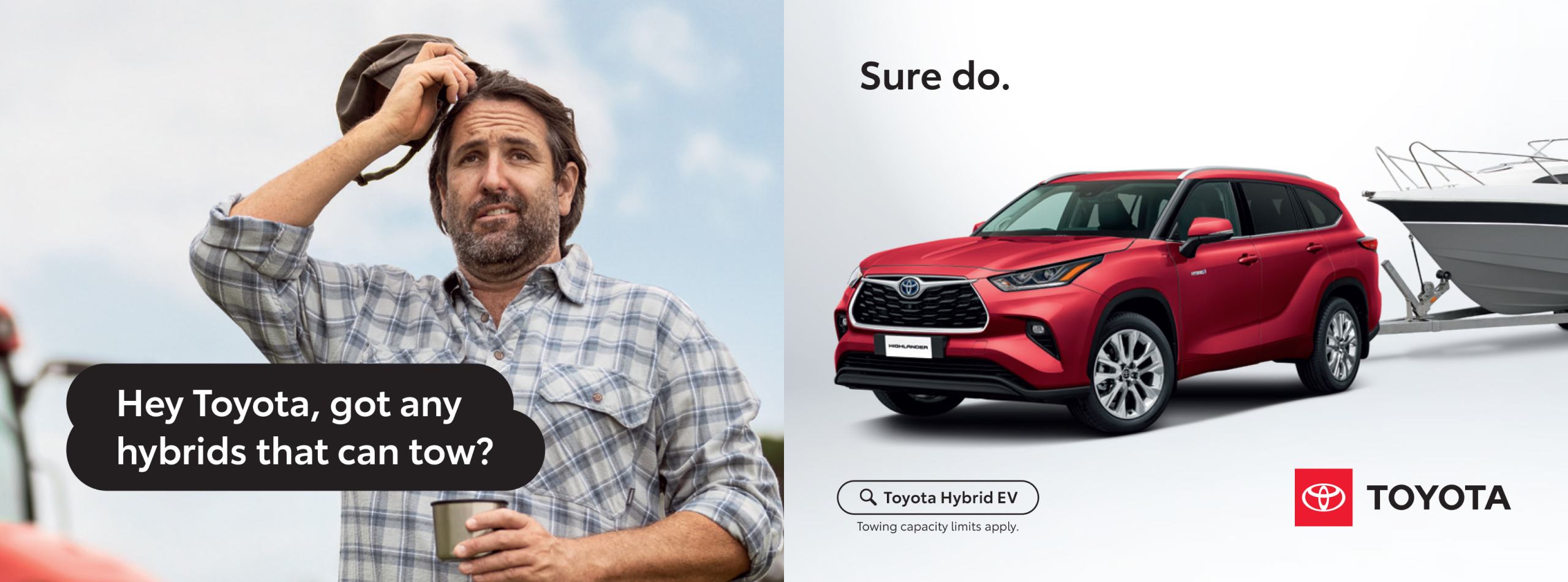
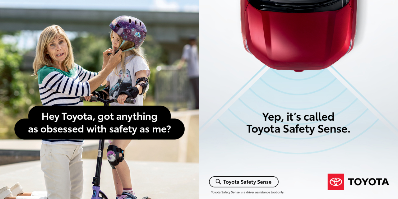
The Messaging Platform construct is founded on a question-and-response style interaction between characters in the real world and Toyota New Zealand.

In TV this comes to life as a high energy conversation, jumping between the real world where our customers are and a white studio environment where vehicles and graphics are based.

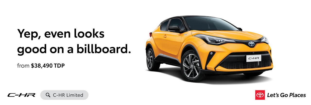
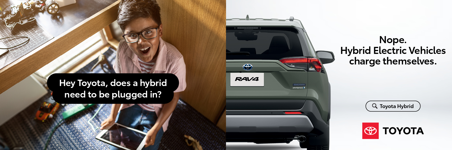
This format is reflected in other channels as well. In print and digital executions, headlines can take the form of a question and answer, or just an answer that infers a question has been asked.

Hey Toyota photography

While the overarching Let’s Go Places photography principles apply to this layer, there are two specific photography components in the Messaging Platform - people and the product.

People

Talent will be shot on location, as if we found them where they are. Natural settings, like a high street, in front of a school, in a garden, standing on a remote beach, in a field, etc.

We need to capture people looking straight down the barrel of the camera, and always looking like they’re mid-question - with a questioning expression, mouth open as if they’re speaking, or head cocked.

It’s important that these feel like active engagements with Toyota, rather than smiling portraits.

Product

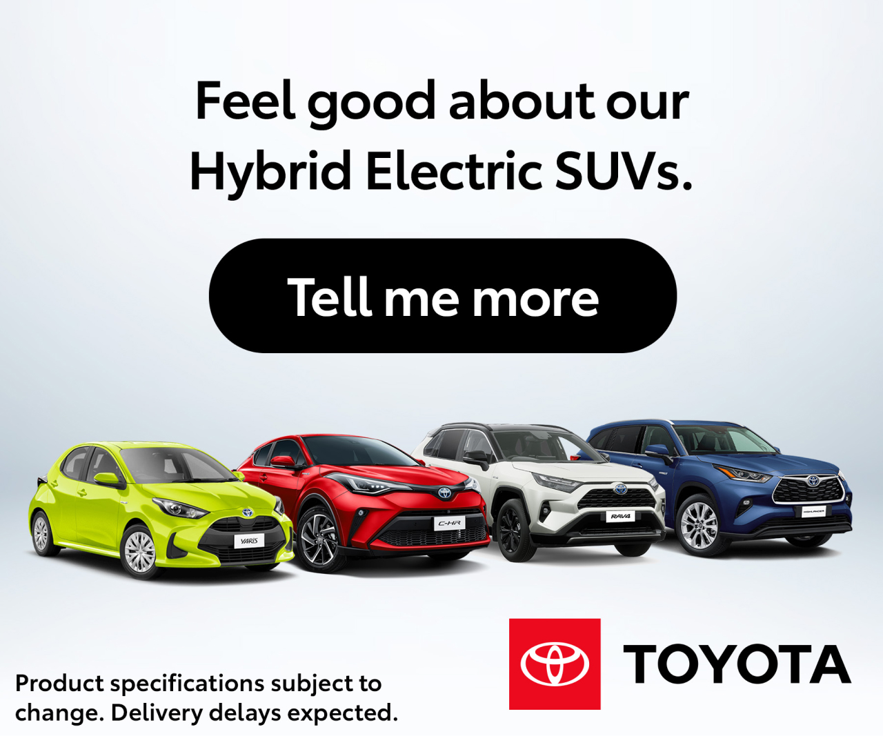
Product photography in the Messaging Platform follows the same guidelines and principles outlined for the overarching brand. Vehicles are set against a white studio backdrop. Cars can be showcased on their own, with props (if necessary) or as part of a range. In instances where a vehicle range is shown, the angles and lighting should match so that they feel like they are in the same space.

Using existing imagery

We will often need to use existing imagery of models within our graphic environment.

The aim is to always make these images feel as though they are within the 3D space.

This can be achieved by using the ‘horizon’ background, adjusting scale to create a sense of realistic perspective, and adjusting lighting so it matches across the range.

Hey Toyota copy

How we speak is friendly, conversational and energetic. We answer honestly. To questions that feel natural and authentic.

Questions represent our customers and should never feel forced. Rather they should reflect real insights and natural language.

Likewise, our answers should be helpful and amiable.

We don’t get caught up in jargon or corporate speak - we explain it.

Succinctly.

This is about putting our responsiveness and customer-centric approach on display.

Question Formats

Under the Messaging Platform there are two approved headline formats. Either ‘Question & Answer’ or ‘Answer Only’.

The former should consist of a question that feels authentically posed from the consumer’s point of view, followed by our response, which is to-the-point and feels conversational. The ‘Answer Only’ format should also feel conversational but imply a sense of the question we are answering.

There’s no need for jargon, unless that’s the question we’re seeking to clarify.

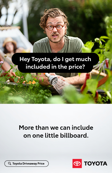
There are two layout options for the ‘Question & Answer’ construct. Either with talent or without. In either case, questions sit within a black text bubble, that is fitted to the type and can either appear over imagery of talent (when used) or alongside the answer.

Responses appear alongside the vehicle in the white studio space and do not require an outline.

A third option using full-bleed imagery is also available, but is reserved for the exclusive right of TNZ marketing and is used primarily to promote more generic topics and the ‘platform’ itself.

Option 1: Question & Answer format
Option 2: Answer Only format

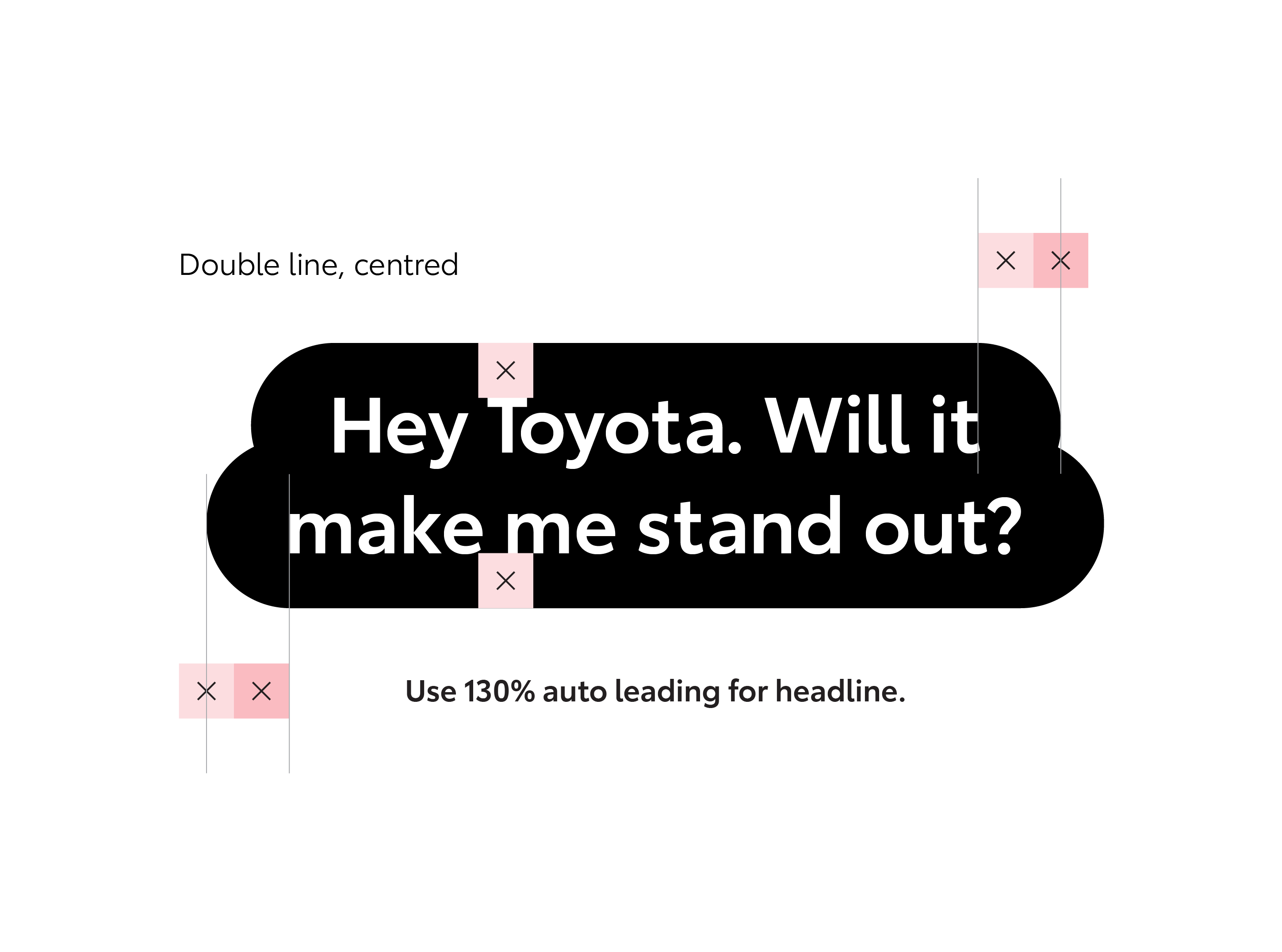
Question Formats – Lozenge

Questions are written in Toyota Type Semibold.

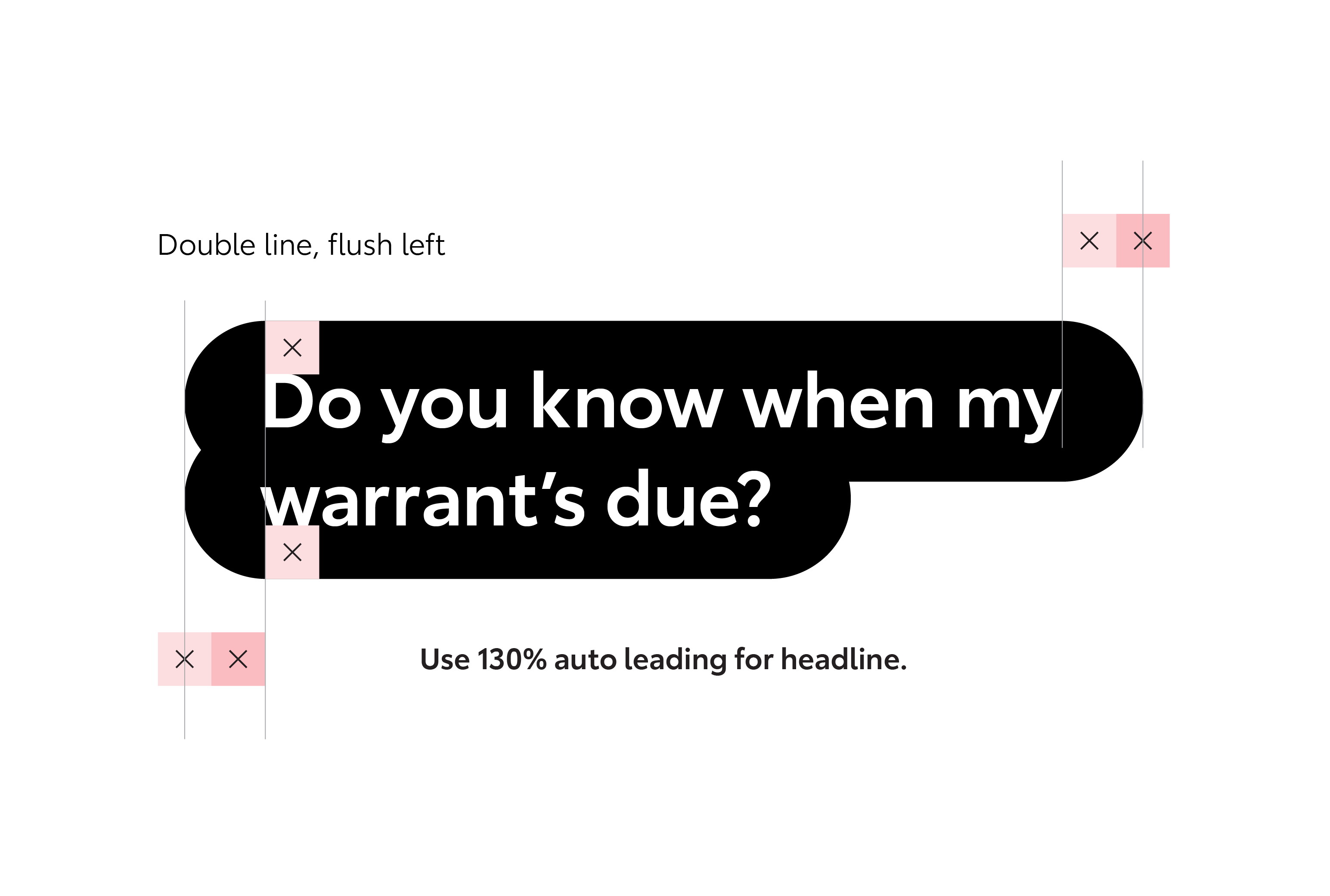
The question portion of a headline sits within a text bubble, or lozenge device. The height and width of the lozenge is relative to the size of the text and can be calculated by the text cap height.

The total lozenge height is 1X from the text cap height and 1X from the text baseline. The total width of the lozenge is 1.5X from the left and right edge of text.

This is then repeated to create the second text line as shown.

Answer Formats

Answers are written in Toyota Type Semibold in the same pt. size as the question.

The answer portion of a headline always sits within the Toyota graphic environment.

There is flexibility within the position of the answer, however its placement should take into account that it needs to be read by the viewer as a response.

CTA / call out graphics

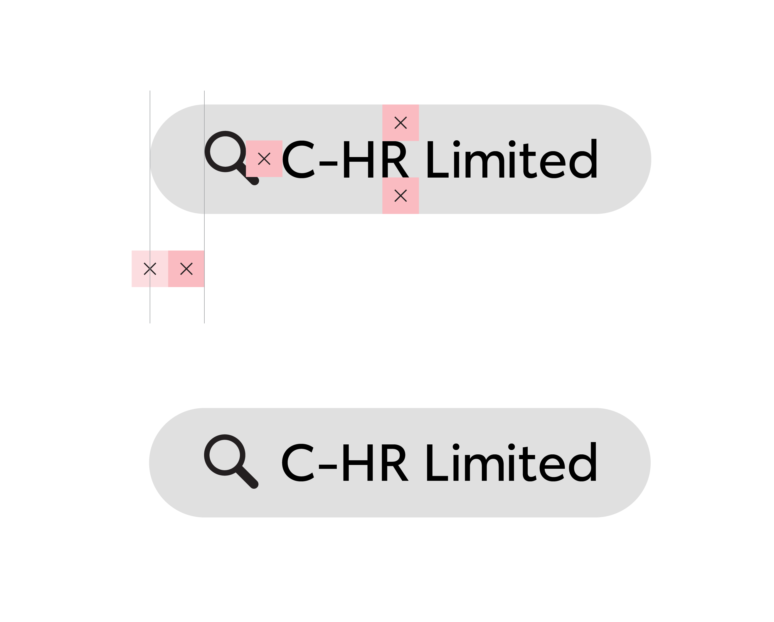
Our standard CTA is inspired by a search field. This visual device allows us to prompt user behaviour without the need of a direct URL. We use this device to call out individual model names or products.

CTA search field

Text is Toyota Type Regular.

The magnifying glass is 140% of the text cap height.

The space between the magnifying glass and text is 1X.

The search lozenge height is 1X from the text cap height and 1X from the text baseline.

The total width of the lozenge is 1.5X from the left and right edge of text.

Lozenge and copy colour are flexible dependant on execution, but should always adhere to approved brand colours and fonts.

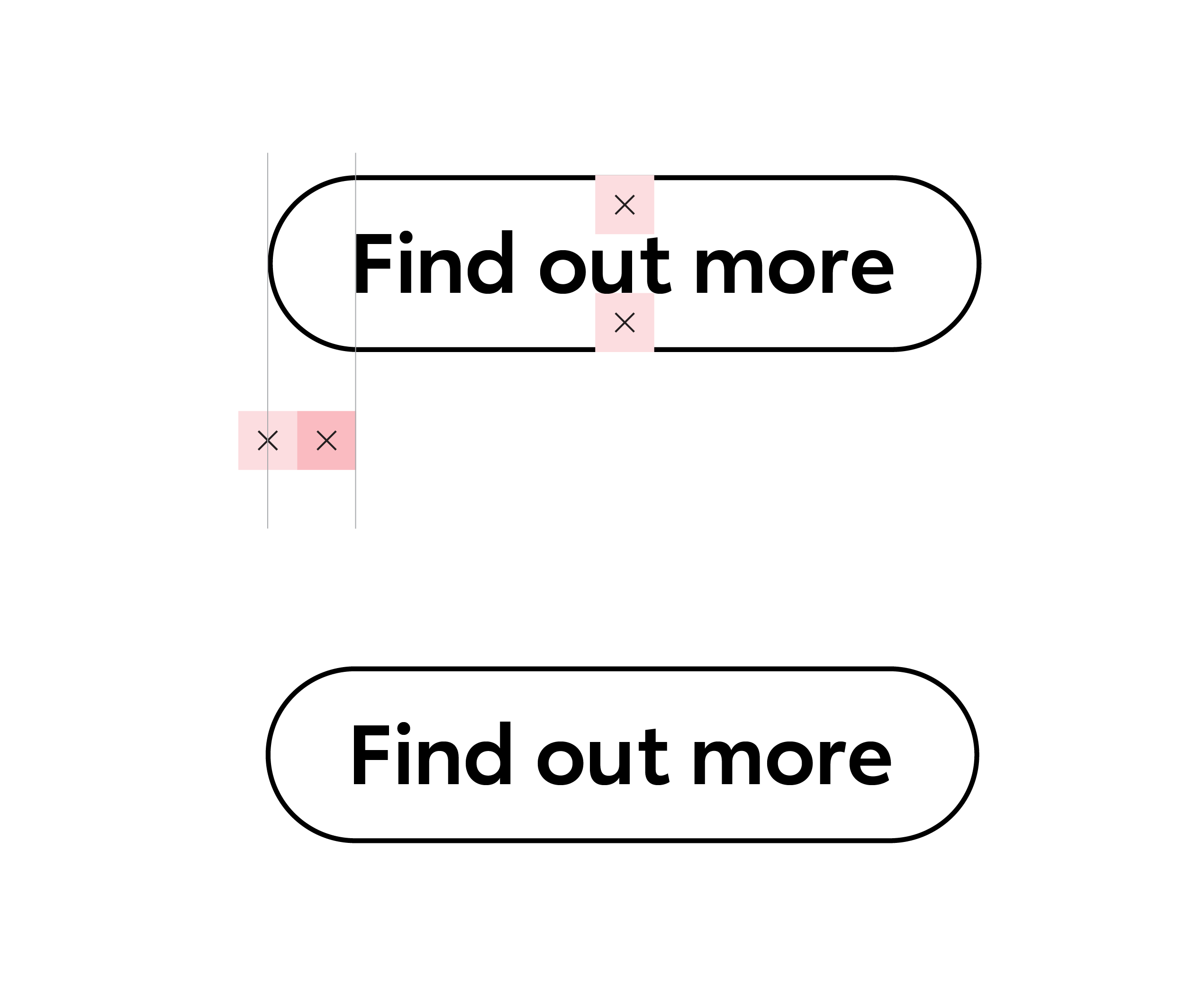
Digital button

In digital environments we can link directly to the desired information, in which case our call-to-action takes the form of a digital button to prompt customers to complete the journey on our website.


The text is Toyota Type Semibold.

The digital button lozenge height is 1X from the text cap height and 1X from the text baseline.

The total width of the lozenge is 1.5X from the left and right edge of text as shown.

Lozenge and copy colour are flexible dependant on execution, but should always adhere to approved brand colours and fonts.

Examples

Toyota Driveaway Price lockup

To visually showcase the added value included with every Toyota vehicle, we have created a standardised ‘inclusions’ lockup for use in retail comms.

This is useful for Product-and-Price executions but can be applied at user’s discretion.