Product Campaigns

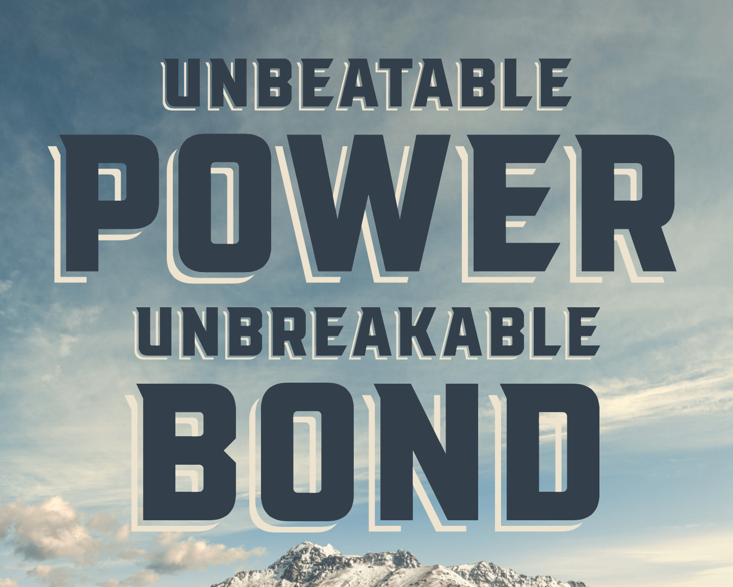
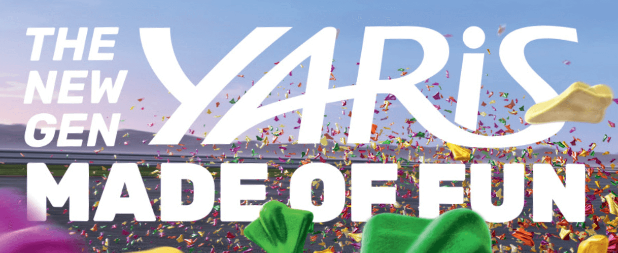
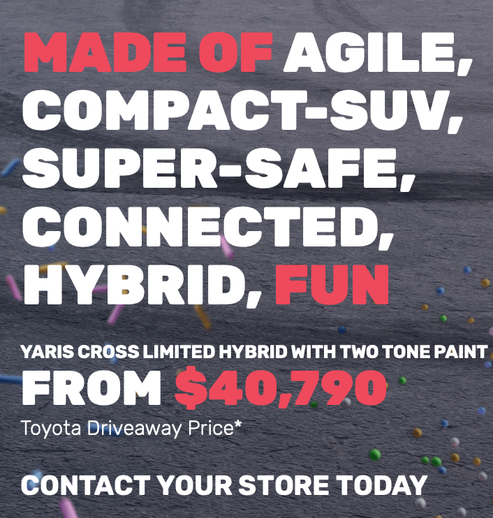
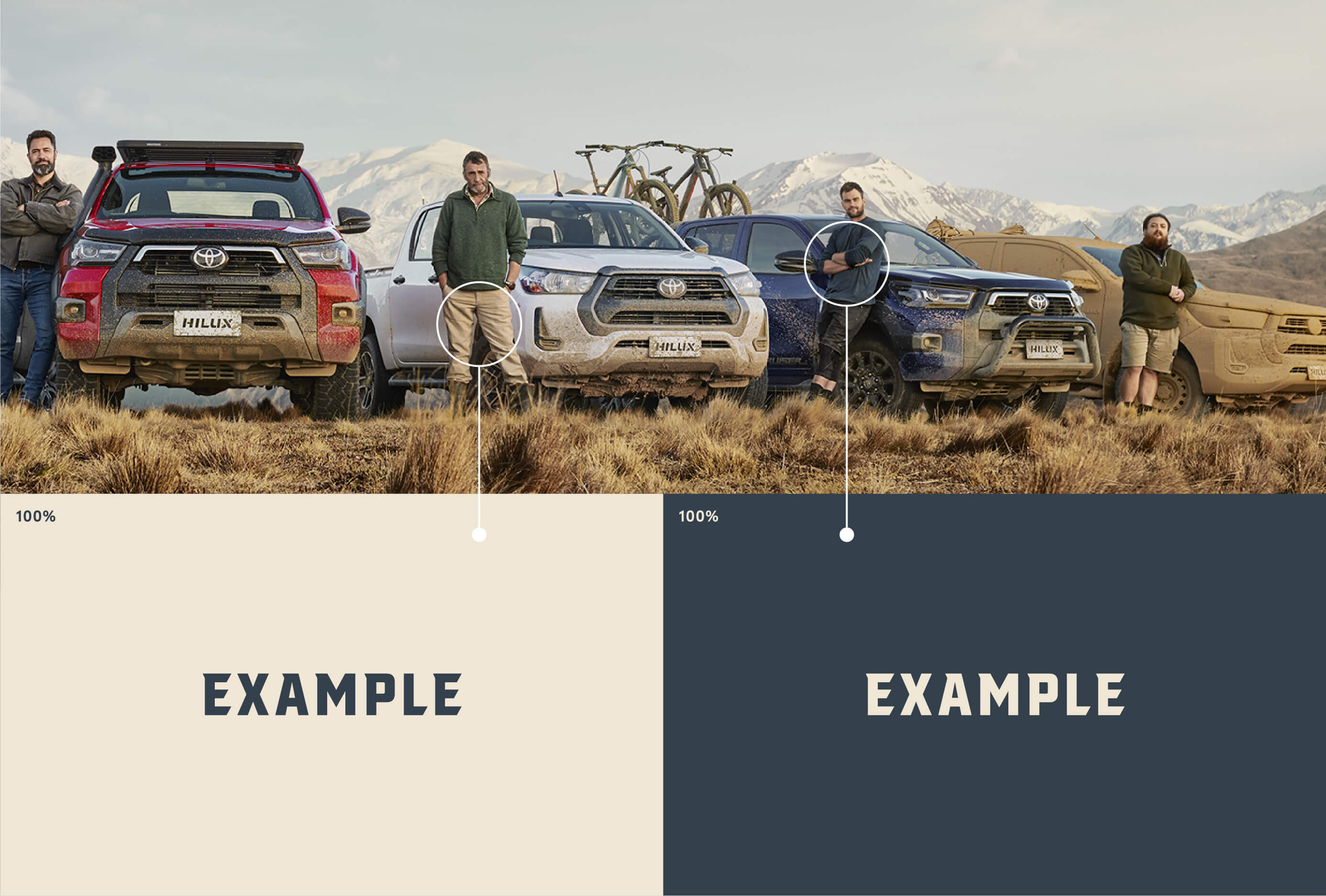
The following pages provide guidelines for Product Campaigns.

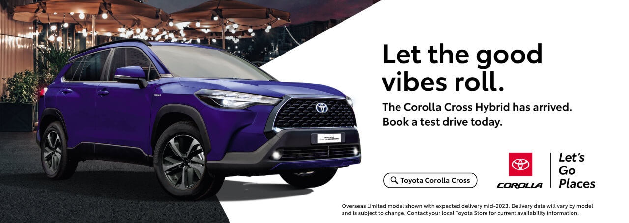
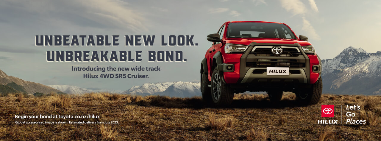
Whether a vehicle or a sub-brand is classed as Product Campaign will be determined at the briefing stage. They will often include, but are not limited to, campaigns for our brand icons: Hilux, RAV4, Corolla and Yaris.

There is plenty of room for flexibility to allow for their own distinctive look and tone, but there are still some guidelines to follow to ensure it feels like a ‘Toyota’ campaign.

DISPLAY FONTS

When it comes to Product Campaigns, typography plays an important part in expressing an idea or mood. Because of this, there is the flexibility to branch outside of Toyota Type and choose a different display font for headlines or subheads. There is also the option to use any font in the Toyota Type family if it works for the campaign idea.

Toyota Type will still be used as the secondary typeface for all other copy ie. body copy, legal text etc.

Below are some examples of Product Campaigns that utilise unique display fonts.

CAMPAIGN COLOURS

Product Campaigns don’t need to adhere to the Toyota colour pallet (red, white and black). A new colour pallet can be created to suit the campaign idea.

Campaign colours can be created by taking cues from other colours featured in the artwork. For example, from imagery or textures.

These colours can also be used as tints to help ensure there’s plenty of contrast between key messaging, logos and graphics.

Layout Examples

Example of where we put the staging platform + vehicle badge + Let’s Go Places
Example of where vehicle badge is used and therefore Primary Toyota / Let’s Go Places logo is used
Example of when a vehicle badge / Let’s Go Places logo is used