
Toyota Type can be used for Brand Campaigns and the Messaging Platform.
Toyota Type is our own distinctive font. It’s approachable, human, yet contemporary. Utilising Toyota Type throughout our communications will ensure consistency and recognition across all touchpoints.
The exception to this rule is internal Corporate Communications and emails where Univers Light is to be used.
Toyota Type
Primary font weights
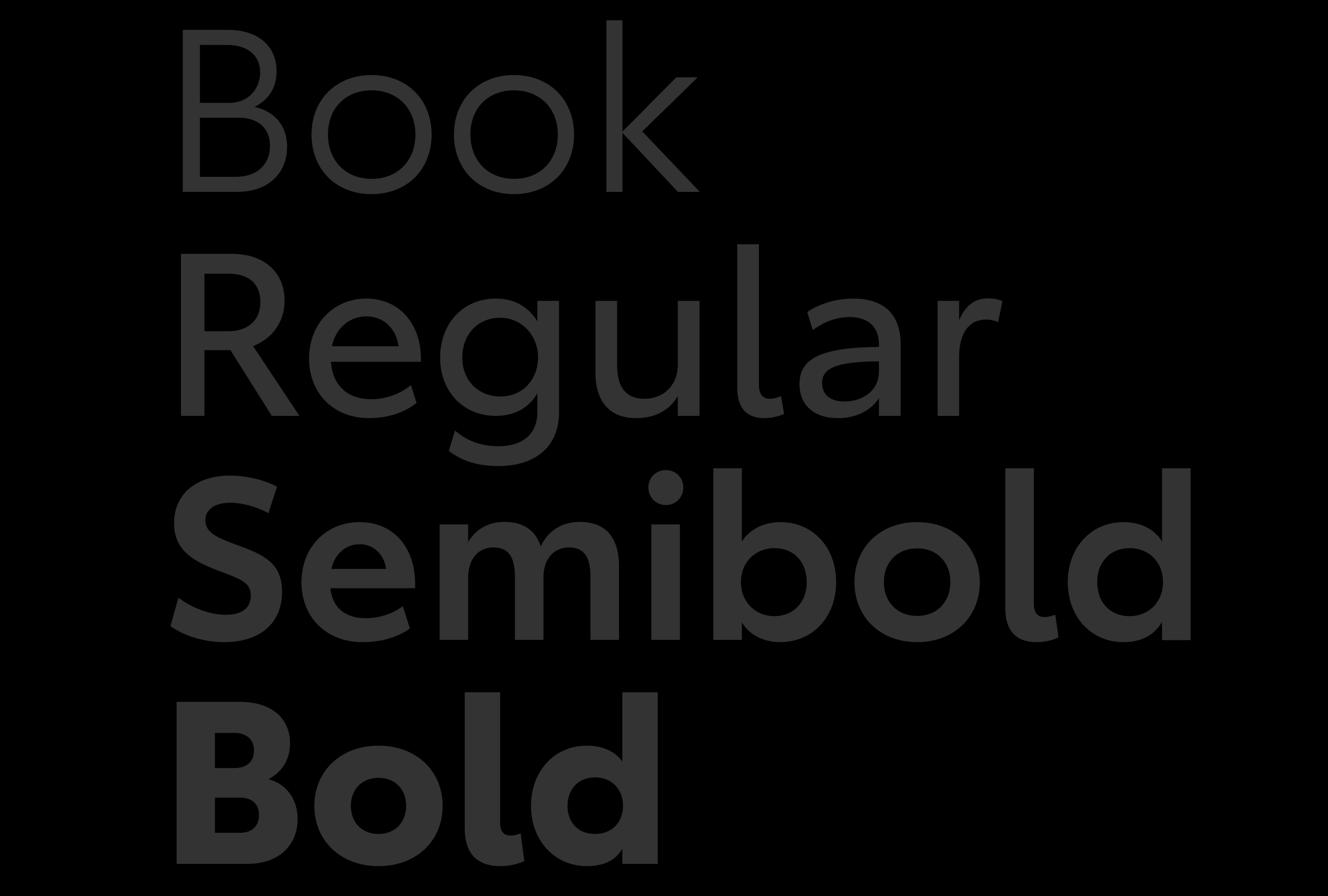
There are four preferred and two optional weights for use within the Toyota Type family. Each weight includes uprights and italics. The selected and acceptable weights are Book, Regular, Semibold and Bold. While additional weights are available within the Toyota Type family, these are the only four that should be used unless a specific case otherwise demands.
Secondary font weights
The optional Toyota Type weights are Light and Black. These may be used when appropriate. Light should be used in instances where the communications are focused on enhanced technology, precision or the weight feels appropriate for the intended message.
Black should be used in instances where stance and presence need to be reinforced, or the weight feels appropriate for the intended message.
TYPOGRAPHY SETTINGS
Below are guidelines for font weight, leading, kerning and alignment when using headlines.
1. Headlines

Use Semibold for headlines.

Use 130% auto leading for print and OOH. Use .09em line height for digital communications.

Use optical kerning with manual adjustments as needed for all print and OOH. Use 0 pixel letter-spacing for digital.

Headlines may be left aligned or centered, but never right aligned.
2. Subheads
Below are guidelines for font weight, leading, kerning and paragraph spacing for subheads.

Always use Semibold weight for subheads.

Use 115% auto leading for print and OOH. Use .09em line height for digital communications.

Use optical kerning with manual adjustments as needed for all print and OOH. Use 0 pixel letter spacing for digital.

For paragraph spacing use the paragraph palette in Adobe InDesign and Illustrator programs to set the space-after adjustments manually. Adjust space after to be twice the cap height of the body copy.
3. Body Copy
Below are guidelines for font weight, leading and paragraph spacing for body copy.

Use Book weight for body text 10 points or larger on light backgrounds. Use Regular weight for body text 10 points or smaller reversed out of dark backgrounds.

Use 130% auto leading for print and OOH.

For paragraph spacing use the paragraph palette in Adobe InDesign and Illustrator programs to set the space-after adjustments manually. Adjust space after to be twice the cap height of the body copy.
4. Legal Text

Use Book weight for legal text 6 points or larger on light backgrounds. Use Regular weight for legal text 6 points or smaller reversed out of dark backgrounds.

Use 130% auto leading for print and OOH.

Use left alignment.

© 2024 Toyota New Zealand