Logo Selection

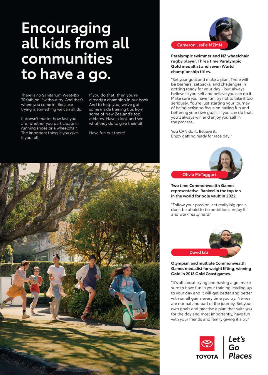
Always aim to use the Toyota ‘Let’s Go Places’ logo on partnership collateral. This will help maximise visual impact when creating partnerships with other co-brands. When necessary single-colour logo options are available.

In special cases a vehicle logo may be used.

Never use Let’s Go Places logo in co-branding lockups.
Title Sponsorships

For title sponsorships, the Toyota logo may be closely aligned or integrated with the logo or title of the event being sponsored.

The full colour horizontal Toyota logo is preferred.

Minimum clear space of 1X around the Toyota logo is needed to ensure visual impact.

The X unit of measurement is derived from the 3x3 grid of the staging platform.

Co-Branding Lockups

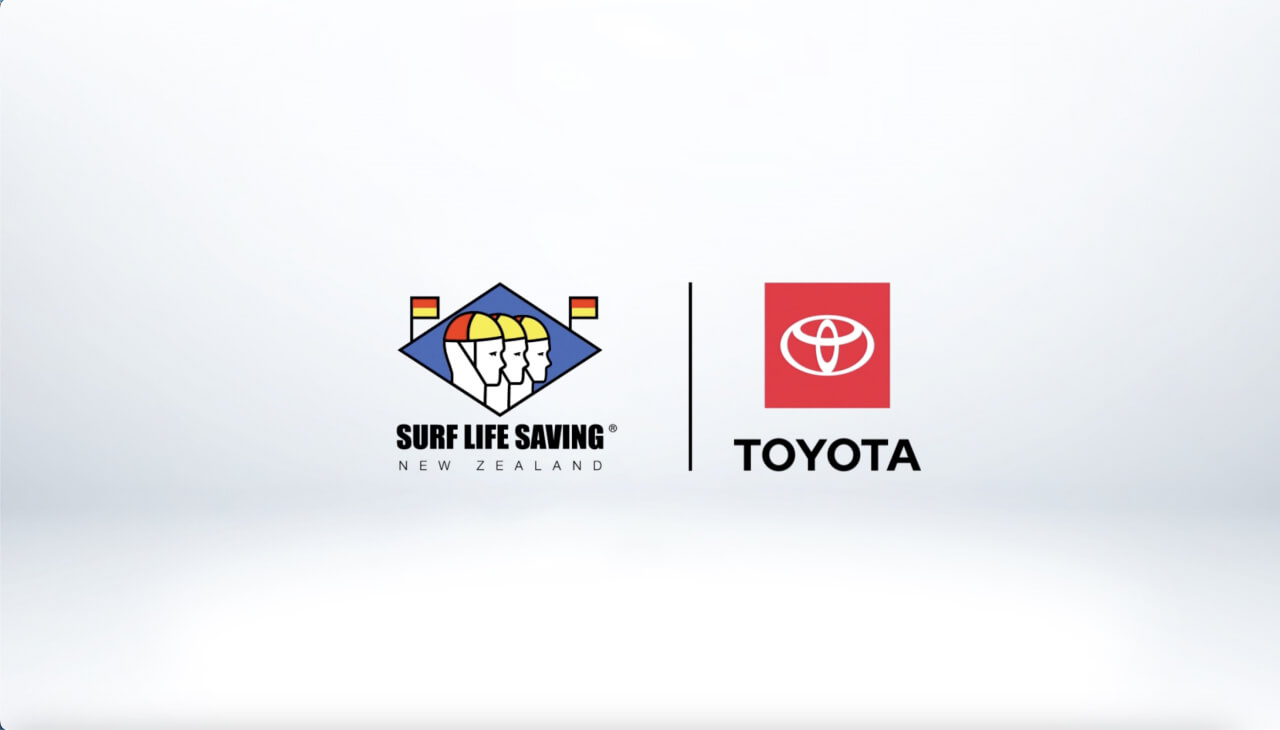
The full-colour Toyota logo (horizontal or vertical) is preferred. Select the version that best matches the shape of the co-branding logo and the surrounding layout.

The Toyota logo should carry the same visual weight as the co-branding logo, unless otherwise specified.

The Toyota logo should be first in the lockup unless otherwise specified.

Toyota would prefer to create co-branding lockups.

Never create lockups using the Toyota logo with store branding.

Configurations

Clear space

When combining the Toyota logo with another logo always use a divider line. The space between the logos and divider line should be 1X.

It’s important to use the 1X minimum clear space requirement around the entire lockup.

The X unit of measurement is derived from the 3x3 grid of the staging platform.

Divider Line

The divider line should extend to the full height or width of the Toyota logo including the wordmark. The thickness of the divider line should never be less than half the width of the downstroke of the T in the Toyota wordmark.

Divider Colour

The divider line should always be the same colour as the Toyota wordmark as shown.

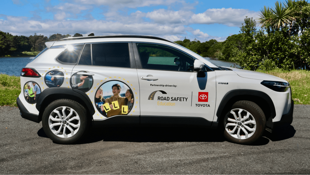
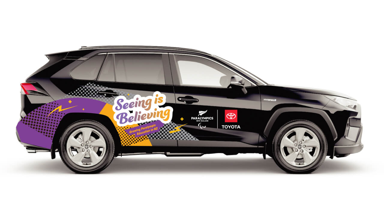
Layout Examples