Primary Logos

Staging Platform

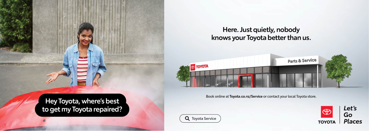
The staging platform is how we refer to the Toyota emblem when shown in the box surround. The staging platform allows the emblem to be anchored, impactful and instantly recognisable as Toyota. This replaces the previous chrome Toyota logo and should be applied to all newly created assets.

The staging platform should only be used locked up with Toyota, or, Toyota & Let’s Go Places, Vehicle Brand or a Toyota Sub-brand. There should never be more than one Staging Platform logo on each layout.

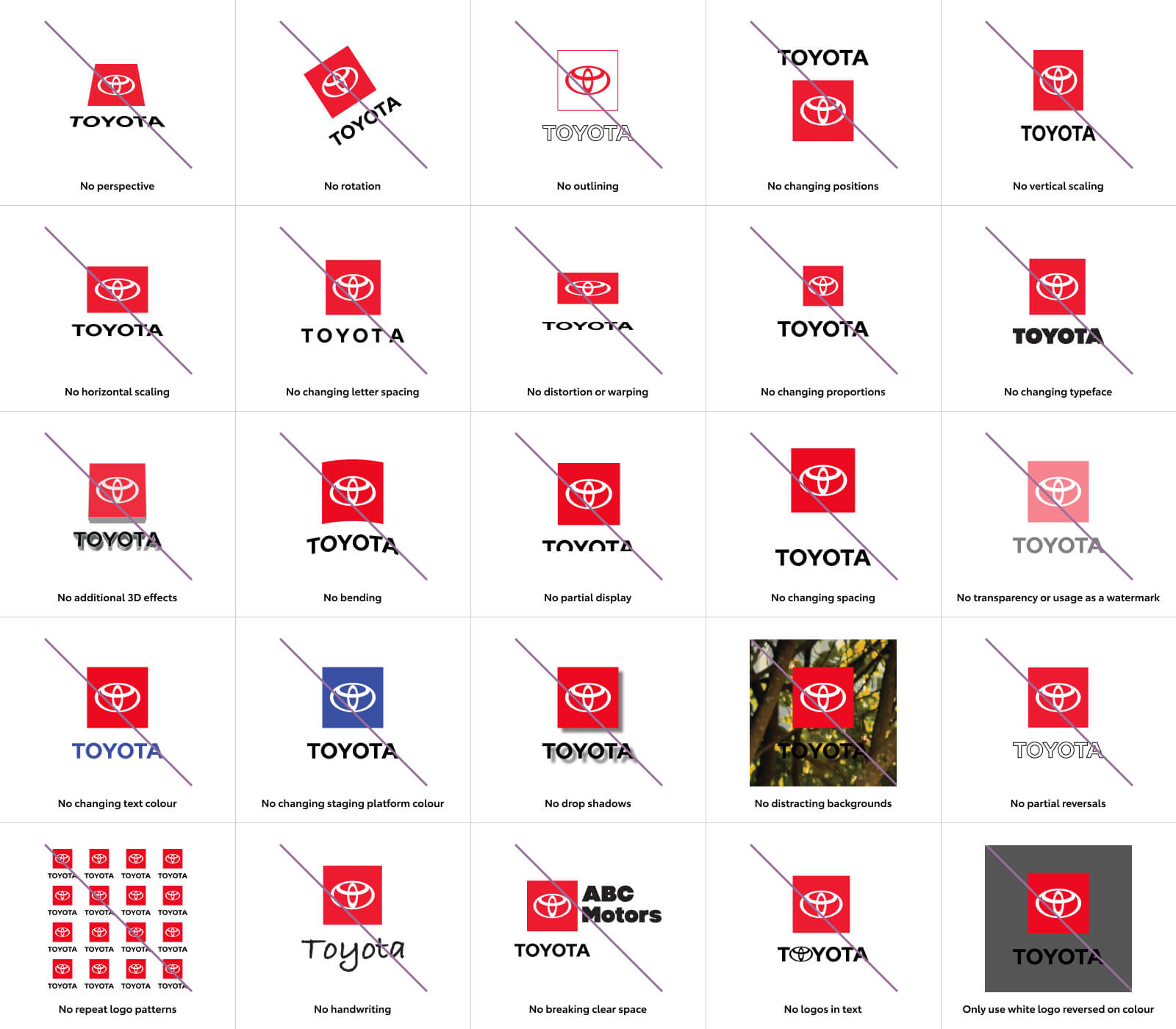
Please do not create your own logo using the staging platform. Only use the logos provided and only as outlined in the brand guidelines.

Six types of logos

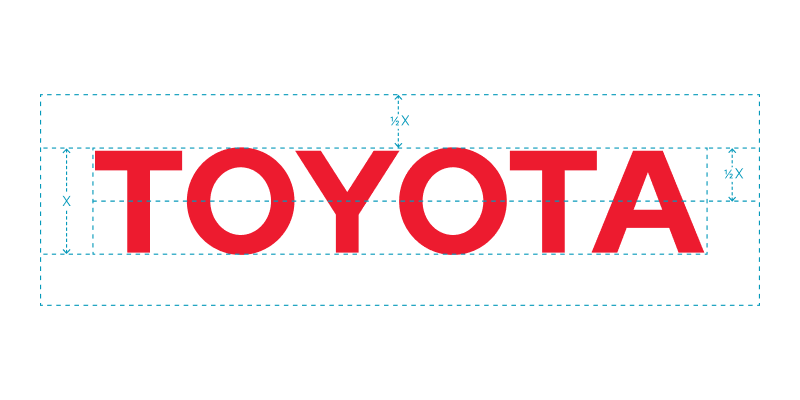
We have the Toyota / Let’s Go Places logo, the Toyota Brand logo, the Let’s Go Places logo, and our various Vehicle Brand and Sub-brand logos. Each is comprised of three elements: the logotype, the Toyota emblem and the staging platform. Keeping to these three elements not only simplifies and unifies our brand design system, but also helps increase recognition of our products.

Toyota Let’s Go Places lock up logo
Toyota logo
Let’s Go Places logo
Hilux logo
Hilux Let’s Go Places lock up
Genuine Parts logo

Toyota Brand logo

Our Toyota master logo is used in sales and brand communications such as internal announcements, collateral and sponsorships. It’s locked up with Let’s Go Places (see guidelines in Let’s Go Places section), when a vehicle badge is used in the headline, or where multiple Sub-brands are being promoted. It should never be used in conjunction with any other staging platform logo.

There is a vertical and horizontal configuration of this logo. Please do not adjust the size of Toyota in relation to the staging platform.

Let’s Go Places

The Let’s Go Places logo is to be used only in instances where it’s unmistakably a Toyota Location e.g. Stores.

There are 3 configurations of this logo, depending on the layout. It should never be used in conjunction with any other staging platform logo, nor should the size or placement of the Let’s Go Places be modified.

Vehicle Brand Campaign Logos

For Vehicle Brand Campaigns, the vehicle badge should be locked up with the staging platform to create a ‘Vehicle Brand Campaign logo’. These logos will be used on campaign elements including, but not limited to, print, digital, AV and OOH.

The exception to this rule is when we use a product nameplate in the creative headline. In this case the Toyota / Let’s Go Places logo is to be used.

The vehicle logo on it’s own is only to be used where it is obviously Toyota e.g.on Store collateral.

The logos should never be used in conjunction with any other staging platform logo. Please use the logos provided and do not adjust the size or placement of the vehicle logo in relation to the staging platform.

Other Vehicle Brand Campaign logos can be developed upon request. (Contact Toyota Marketing)

Sub-brand logos

There are a number of Toyota Sub-brands in New Zealand and each of these have their own Sub-brand logo. The logos use the staging platform to ensure that they are recognisable as being a Toyota brand and to create consistency, no matter the product, service or program.

The design and configuration of each Sub-brand logo has been individually crafted and carefully considered, so please do not type set it manually.

Configurations

Clear space

Minimum clear space around the logo ensures visibility and clarity. The Toyota, Let’s Go Places, Vehicle Brand or Sub-brand logos should be kept clear of other logos and design elements. To measure clear space, the layout unit of measurement, "X," is used. "X" is derived from dividing the staging platform square into a 3x3 grid; each grid unit is equivalent to 1X. The minimum clear space required around the logo is 1X, both horizontally and vertically.

The minimum clearance for the Toyota wordmark is defined by drawing a rectangle around the edges of the mark.

The minimum distance between the rectangle and any element is a distance of ½ X. X being the height of the Toyota wordmark.

Minimum size

The minimum acceptable size refers to the width of the staging platform.

The minimum size is 9mm wide in print and 24 pixels wide in digital.

Logo Placement

The recommended placement for the logo is the bottom right hand corner of artwork. Minimum size guide and clear space also to be taken into account. See below for some examples of logo placement across a number of creative layouts. There will be certain instances where the right of the layout isn’t best, in this case position the logo on the left.

Colour Variations

Full-colour logos - preferred

There are two full-color options available for each of the six approved types of logo. The full-colour primary logos should be used on a white or light background and the full-colour secondary logos should be used on a mid-value or dark background.

Single-colour options

When necessary single-colour options are available. They are black or Toyota Red on a white background, or a reversed white logo on a black or Toyota Red background.

While the preferred background colours are white, black or Toyota Red, alternative-colour backgrounds may be used when a co-branding partner controls the background colour. In such an instance, ensure that legibility and impact are optimised.

The Toyota logos should not be produced over a pattern or colour gradation that undermines legibility.

Incorrect Usage

For both building brand awareness and protecting the trademark of our brand, it's important to retain consistent and correct use of all our logos. In general, do not alter any of the logos in any way. The following examples illustrate possible misuses and simple rules to follow. These examples apply across our entire suite of logos.